Why Police Cars Are Different Colours Across Europe
The Psychology of Visibility and Local Rules
You know that moment on the M60 when you’re coming past the Stockport Pyramid and you spot a police car in your mirror? You haven’t even read the writing yet, but your brain has already gone, “Yep, police.” That fast “spot and react” feeling is exactly what vehicle colours and markings are meant to trigger. Now here’s the twist: if you took the same drive but dropped yourself into Paris, Rome, Berlin, or Stockholm, the police cars wouldn’t match the UK look. Some are white with blue panels. Some are silver with bright blocks down the side. Some lean hard into national colours. And some look “simple” until night-time, when the reflective parts suddenly jump out under headlights. It can feel random, but it isn’t. A lot comes down to how humans notice things on the road, plus what each country’s rules and traditions say police vehicles should look like. There’s also the practical stuff nobody talks about at the dinner table, like leasing costs, resale value, and how easy it is to standardise a design across a whole country. At Dace Motor Company we spend our days around cars, and we hear customers chat about everything from paint colours to visibility and safety, so this topic comes up more than you’d think, especially when people are planning a road trip across Europe or buying a car that’s been imported. And once you start looking for these differences, you can’t unsee them, even when you’re just stuck at the lights by Stockport Viaduct watching traffic crawl.
Colour is a shortcut your brain uses
Let’s face it, you don’t “read” a police car like you read a sign. You clock it in a flash, and your brain does the rest. Colour is a shortcut your brain loves because it saves time. Under normal daylight, the human eye is most sensitive around a yellowish-green part of the spectrum, with a peak around 555 nanometres. That’s one reason bright yellow and yellow-green show up so much on things that need to be seen quickly, like road safety gear and warning markings. But colour alone isn’t the whole trick. Contrast matters just as much. A bright shape next to a darker shape gives your eyes an “edge” to grab onto, and edges are what your brain spots fast when you’re moving. That’s why you see bold blocks, stripes, and repeating patterns, not just one plain bright strip. The pattern keeps pulling your attention back, even when the vehicle is partly hidden behind other cars or street furniture. There’s also a learned side to this, which is basically training your brain without realising. If you grow up seeing a certain pattern on police cars, you react to it faster because you’ve seen it a thousand times. Researchers looking at emergency vehicle visibility talk about how colour and reflective materials can improve how noticeable vehicles are, but recognition matters too, because you need to understand what you’re seeing, not just see “something bright.” So across Europe you get a blend of science (what your eyes catch quickly) and culture (what a country’s drivers already connect with authority and emergency response).
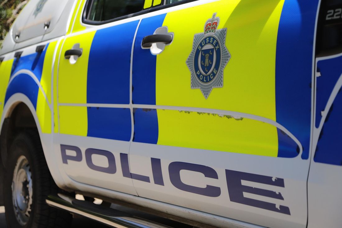
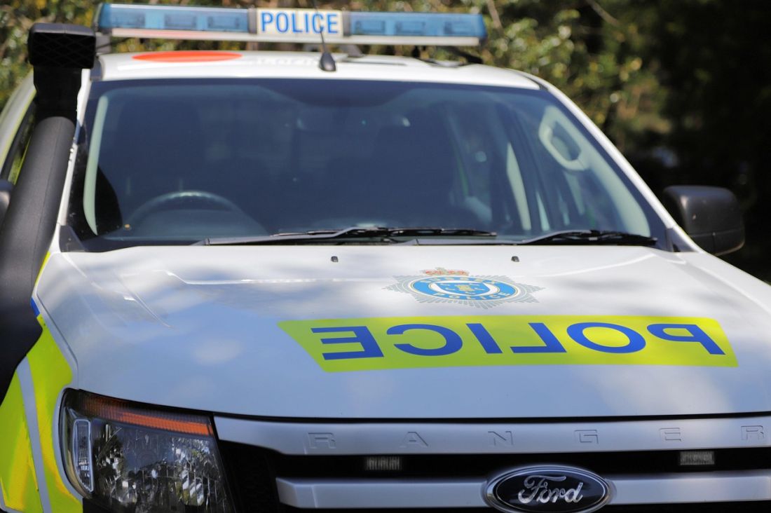
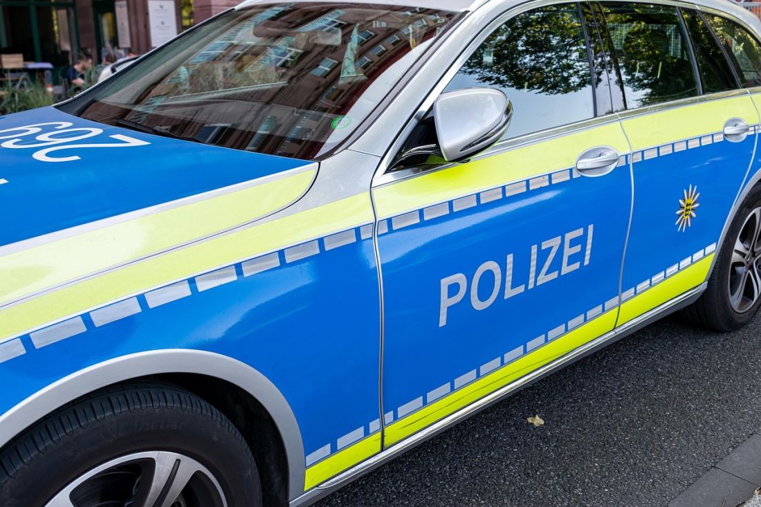
The UK look: from “jam sandwich” to Battenburg
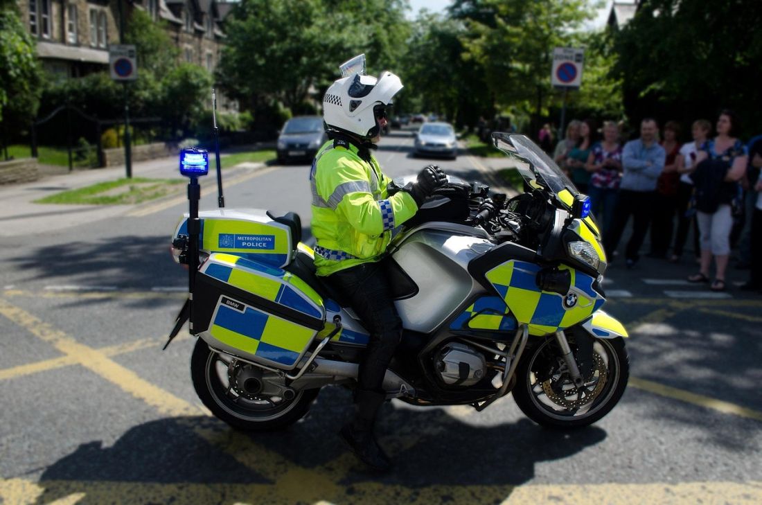
In the UK, police vehicles have gone through a few famous looks, and people still talk about them like they’re old football kits. One of the best-known is the “jam sandwich” livery, that mostly white car with a big red or orange stripe along the side. The nickname became common in the 1970s, and the design was used across much of the country from the mid-1960s until the early 2010s. The history is pretty down-to-earth: stripes were a simple way to make a plain white fleet more visible, especially on faster roads. That same source links an early fluorescent stripe on vehicles to East Sussex Constabulary in 1965, backed by Chief Constable George Terry. Later, London’s Metropolitan Police put the “jam sandwich” look onto traffic cars in 1978, including Rover SD1 models, and it became part of the public’s mental picture of police cars. Then the modern UK look arrived: Battenburg markings, the blocky rectangles you see on lots of police and other emergency vehicles today. Those markings were developed in the UK in the 1990s. The point wasn’t just “make it bright.” It was “make it bright in a way that stays recognisable at speed, in bad weather, and under headlights.” The repeating blocks create lots of edges, and that makes your eyes keep picking the car out from the background. And because the pattern became linked with police work over time, it turned into a quick signal: you see the blocks, you know what you’re dealing with, and you adjust your driving without thinking too hard about it. That’s why the UK moved away from simple stripes and into bigger blocks as roads got busier and the need for instant recognition got more important.
Why blue keeps popping up across Europe
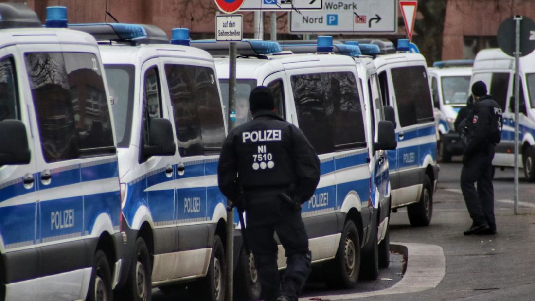
When you look across Europe, blue turns up again and again on police cars, and it’s not just because it “looks official.” There’s history, because many European police forces use blue in uniforms and signage, and matching the cars helps people join the dots. But there’s also a modern “get everyone on the same page” push. Germany is a great example because it changed in a really noticeable way. For years, many people thought of German police cars as white with green markings. But sources describing German policing say vehicle liveries changed from white/green to silver/blue across German state police and the federal police by 2018. That same discussion points out a practical reason people don’t expect: silver base vehicles are easier to sell later, which helps resale value and can lower leasing costs. So part of the “why blue?” answer is not about psychology at all. It’s about budgets and fleet management. And it’s not just Germany doing updates. Sweden is another interesting case because sources describe Swedish police vehicles moving through different looks and then adopting a light blue and fluorescent yellow Battenburg-style livery in 2005. That’s a different colour combo to the UK, but it aims for the same outcome: high visibility and quick recognition. Put all that together and you can see the pattern across the continent. Countries copy ideas that work, adjust them to local identity, then standardise so drivers learn the new “police look” without needing to study it. Different paint, same goal: you need a car that drivers notice quickly, trust as real, and understand without having to stop and think.
The bright bits: reflective materials and why they look like they glow
Now let’s talk about the bright, shiny bits, because this is where police cars can look totally different in daylight but surprisingly similar at night. A lot of modern markings use reflective materials that throw light back at the source. So when your headlights hit the side of a marked police car, the markings can look like they’re lit from inside. 3M explains that retroreflective materials appear brightest to an observer located near the original light source, like a driver looking from near their own headlights. That’s why the same strip can look pretty normal in the day, then pop hard at night. It’s not there to look stylish; it’s there to stop people drifting into a parked vehicle on a dark road. And it’s not just about reflection. Studies of emergency vehicle visibility talk about fluorescent colours (especially fluorescent yellow-green and orange) giving higher visibility in daylight, and about reflective materials having real promise for making emergency vehicles easier to spot. There’s also a sensible warning in that research: too much reflection, in the wrong place, can make it harder for drivers to pick out other hazards. So design is always a balancing act. You want “easy to see,” but you also want “easy to understand.” And while police cars aren’t the main target of the big international rules people sometimes mention, Europe does have well-known standards for reflective markings on larger vehicles, like a United Nations rule called Regulation 104 for retro-reflective markings on certain heavy vehicle categories. Different subject, same idea: if you can see the outline of something sooner, you can react sooner, and that’s safer for everyone.
France: national identity, modern designs, and clear rules
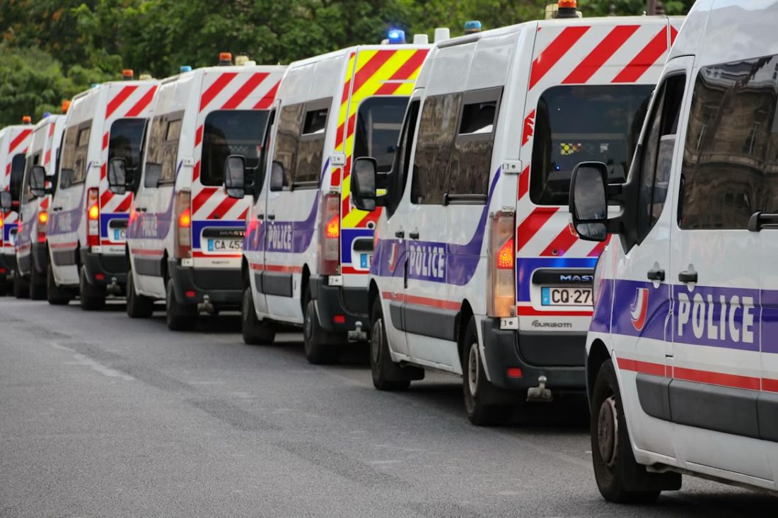
France is a great example of how design is tied to national identity and backed up by rules. French Police Nationale vehicles changed their look in 2007, moving to a more modern livery that uses a strong blue band with a thin red line and “Police nationale” integrated into the graphics. Earlier designs leaned more on white vehicles with horizontal blue and red lines, and sources describing those liveries mention mirrored “police” text on the bonnet so it could be read in a rear-view mirror. That’s a small detail, but it’s clever, because it helps with recognition in traffic, which is where a lot of people first notice a police vehicle. And France also shows how the rules side can get very specific. Municipal police in France, for example, have formal requirements about insignia. A 2014 French legal text sets out what the municipal police badge must include, including the national colours “blue, white, red,” the letters “RF” for the French Republic, and the word “police,” plus local town details. This isn’t just paperwork for the sake of it. It helps the public spot official vehicles and official staff, and it helps reduce confusion with look-alikes. Then you’ve got the Gendarmerie, which is a separate force with its own visual identity. French automotive sources discussing their vehicle colours describe the move from black to blue, with blue appearing on vehicles in 1969. So in France, colour isn’t just “visibility.” It’s also “who are you, exactly?” and “are you allowed to use these markings?” That’s why you see designs that feel very “French,” mainly through the use of blue, white, and red in ways that the public instantly associates with the state.
Italy: blue-and-white tradition, plus the flag stripe
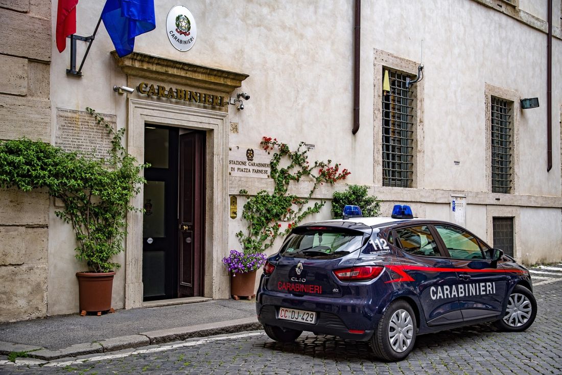
Italy takes a similar “identity matters” approach, but it does it in a very Italian visual style, where the car still looks clean and sharp. The Polizia di Stato has long been linked with a blue-and-white scheme, and the point is instant recognition in busy streets. In November 2014, Italian motoring press reported the presentation in Rome of a new livery for Polizia di Stato cars, and the report names key people present, including Pietro Grasso and the Chief of Police Alessandro Pansa. Another Italian motoring source described the traditional blue-and-white being enriched with a tricolour band running along the side, which is basically the Italian flag stripe worked into the livery. That stripe does two jobs at once. It makes the vehicle feel officially “state” in a way you don’t need to translate, and it creates a clean line your eyes can track when the car is moving through traffic. It’s subtle but effective. And Italy keeps updating. In November 2025, an official Polizia di Stato site post described the presentation of a new livery for their cars, which shows the design is treated like a live thing that gets refreshed, not something that’s fixed forever. That fits the bigger European pattern: a base scheme people already recognise, plus tweaks that improve visibility and keep the look modern. So if you’re driving in Italy, you might see vehicles that clearly share the same identity but aren’t identical year to year. That can feel confusing if you expect “one perfect standard,” but it makes sense when you remember the purpose. These aren’t display cars. They’re working vehicles that need to stay visible, recognisable, and believable as real police, in cities packed with scooters, narrow streets, and constant stop-start movement.
What this means for you on real roads
So what does all of this mean for you on real roads, especially if you’re driving around Greater Manchester or heading abroad? First, don’t rely on one UK-only clue like blue-and-yellow blocks. In many places you’ll still see blue, but the base car colour might be white or silver, and the high-visibility bits might be smaller, moved to the rear, or swapped for a different bright shade. If you’re in a hire car somewhere unfamiliar, the safest habit is to look for a mix of cues: clear text in the local language, a consistent graphic scheme that repeats on both sides, and proper roof lights rather than a random sticker. That sounds basic, but it’s amazing how much calmer you feel when you stop guessing. Second, remember that vehicles can be “re-skinned” without changing the car underneath. In Germany, police vehicles are commonly leased and marked using removable film rather than paint, then returned to plain silver when sold on, and German policing sources explain that the silver base colour helps resale value. So if you’re shopping for a used car and you’re curious about a vehicle’s past, don’t judge it by paint alone. Check the paperwork, check the history, and ask sensible questions. Back home, if you’re crawling along the Mancunian Way, edging past MediaCity, or stuck near the Trafford Centre on a Saturday, that “spot and react” skill still matters, because it helps you make smooth, safe decisions without panic braking. And if you’re sorting the money side of a purchase, it’s fine to ask for checks early so you’re not guessing. At Dace Motor Company we do used cars across a wide mix of makes, and if you’re looking at finance we can run a soft credit check that doesn’t affect your credit score, which is a handy way to see what’s realistic before you fall in love with a car. Finally, don’t forget what all these designs are trying to do. Reduce surprises. Make roles clear. Get your attention without you having to squint or guess. That’s police livery, really: keeping the road experience calmer for everyone.