The Quiet Reason Cars Still Use Physical Buttons for Hazard Lights
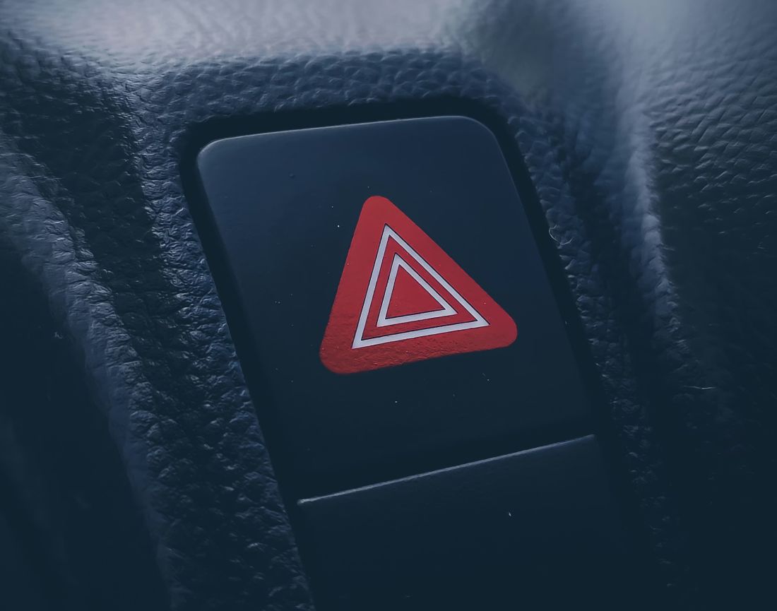
That little red triangle isn’t there to look nice
You know that hazard light button? The one with the red triangle that you can find in almost any car, new or old. It’s funny, because cars have changed loads in the last few years. Big screens. Smooth dashboards. Menus for everything. Yet that one button keeps showing up as a real, press-it-with-your-finger button. And it’s not because car makers are being old-fashioned. It’s because hazard lights are the “something’s wrong right now” signal. A second feels like a minute when you’re stuck on the M60 near Stockport Viaduct with cars flying past, or you’ve had to pull over on the A6 in the rain and your heart’s banging like a drum. In that moment, you don’t want to hunt through a screen, tap the wrong icon, then tap again because the first tap didn’t register. You want a single move. Press. Flash. Done.
At Dace Motor Company we see all sorts of interiors, from simple runabouts to fancy German stuff with screens bigger than a telly. And no matter what badge is on the bonnet, there’s a theme: the hazard lights need to be dead easy to switch on. People don’t use hazards when they’re calm and relaxed on a sunny Sunday drive through Heaton Moor. They use them when something’s gone sideways. Breakdown. Sudden queue. Someone’s stopped ahead. Or you’ve just had a near miss and you need the car behind to clock what’s happening. That’s the quiet reason the button is still a button. It’s built for panic-brain, not sofa-brain.
Rules: why the icon and the control stay the same
There’s also a boring-but-important reason: rule books. Car controls aren’t a free-for-all. Across different countries, there are standards that say what symbols mean and how drivers should recognise them fast. The hazard warning symbol is one of those. In the symbol standard used across the industry, the hazard warning sign is tied to the control itself, and it’s linked to the idea of both turn signals flashing together. So the triangle isn’t just “a nice graphic.” It’s a shared language so you can jump into a different car and still know what you’re looking at.
In the UK, the lighting rules talk about hazard warning devices as a thing in their own right: one switch that makes all the direction indicators flash together. That’s basically the job description of hazards in one sentence. And in the US, road-safety rules use similar wording: a driver-controlled unit that makes the turn signal lamps flash at the same time to show a hazard. Different places, same idea: hazards are a distinct “I need attention” signal, and the driver needs a clear way to trigger it.
Now, does a rule book literally say “it must be a physical button”? Not always in that exact wording. But the rules and standards push the same direction: quick recognition, quick activation, no confusion. And when you combine that with real-world safety testing (we’ll get to that), physical controls keep winning because they’re easier to hit correctly with your eyes still on the road. That’s why the red triangle survives while other controls get shoved into a screen.
Stress messes with your fingers, and cars have to plan for that
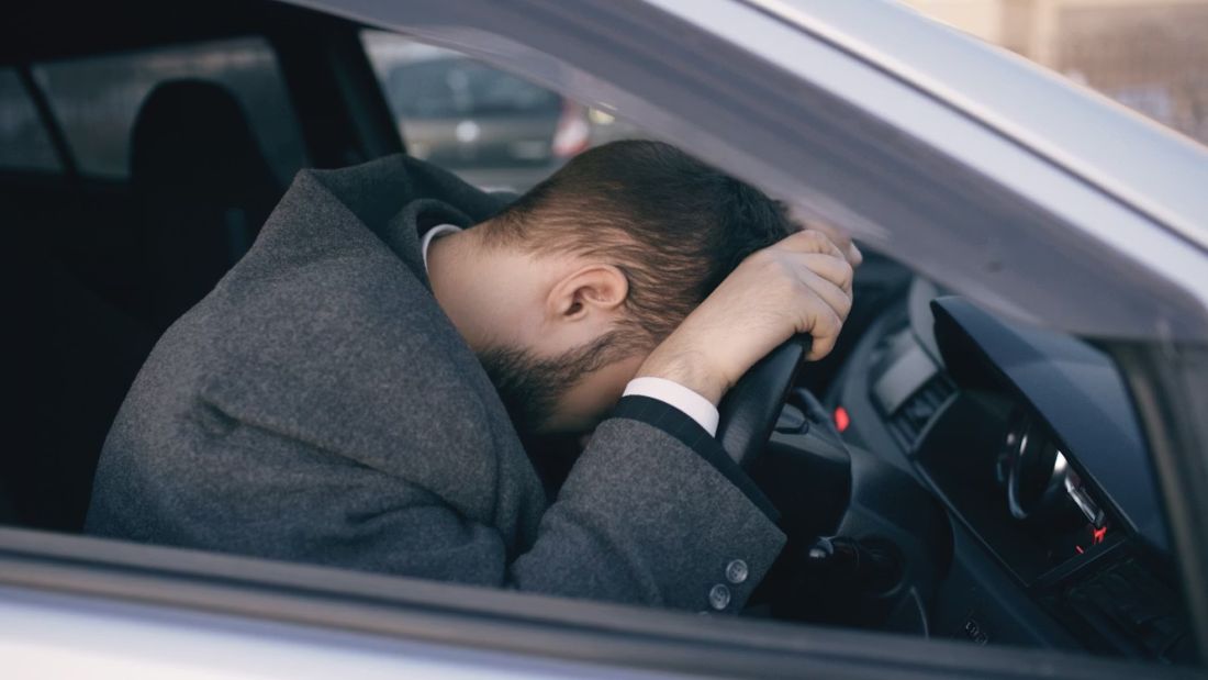
Let’s talk about the bit nobody thinks about until it happens. When you get stressed or scared, your body changes gear. The NHS even explains it in plain terms: stress can trigger adrenaline, which gives you a boost to act quickly. That boost is handy, but it also makes you a bit jittery. Hands can feel clumsy. Your grip changes. Your brain gets narrow and shouty. This isn’t you being “bad at driving.” It’s your body reacting like it’s meant to.
A famous scientist, Walter Bradford Cannon, wrote about this emergency response more than a century ago. He described how the body gets ready for “fight or flight” by switching systems on and pushing energy around fast. In real life, that can mean you go from calm to stressed in one second flat. Think: a car brakes hard in front of you near the Trafford Centre roundabouts, or you hit standing water on a back road out toward the Peak District edge and the steering goes light for a moment. Even if nothing bad happens, your body still reacts.
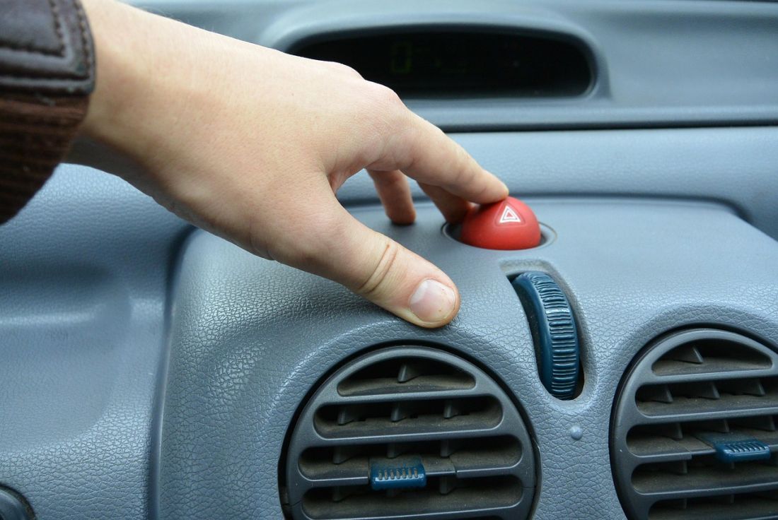
So here’s the point: hazard lights are used in the exact moments when your fine finger control can be at its worst. That’s why a physical button makes sense. You can slap it with the side of a finger. You can press it with a thumb without being delicate. You can find it by feel. A flat screen icon is the opposite. It needs accuracy. It needs you to look. It needs your skin to play nicely with the glass. In a stress spike, that’s asking a lot. A proper button is like a panic handle: it meets you where you are, not where a calm designer imagines you’ll be.
Screens steal your eyes, and safety groups are finally saying it out loud
Here’s the thing with touchscreens: they demand attention. Not “a quick glance,” but real focus. AAA research looked at drivers doing common in-car tasks and found people could be visually and mentally distracted for long stretches, with some tasks taking around 40 seconds to finish. That doesn’t mean your eyes are off the road for 40 seconds in one go, but it does mean your attention is getting yanked away again and again, which is still bad news when you’re rolling past Junction 25 on the M60 with lanes merging and people changing lanes like they’re late for kickoff.
Safety guidance also gets very blunt about glance time. NHTSA’s distraction guideline talks about risk jumping when drivers look away from the road for more than 2 seconds in a short window, and it sets limits for how long tasks should take in total. That’s why the hazard button being “one press, no menu” matters. It’s not a luxury. It’s a safety shortcut.
And now the big testers in Europe are putting real pressure on this. Euro NCAP has a protocol for driver engagement and controls where hazard lights are literally listed as a driving function that the driver has to activate and deactivate in testing. They also spell out what they mean by a “direct physical input”: something you can locate by touch with basically no gaze away from the road, with a real feeling of movement when you operate it. That’s a fancy way of saying: a proper button works better when you’re driving. Their documents even mention real-life stuff like cold fingers, dry fingers, gloves, and hands that aren’t playing nice with touch surfaces. That’s Manchester in winter, to be honest.
Why the hazard button is where it is, and why it feels the way it feels
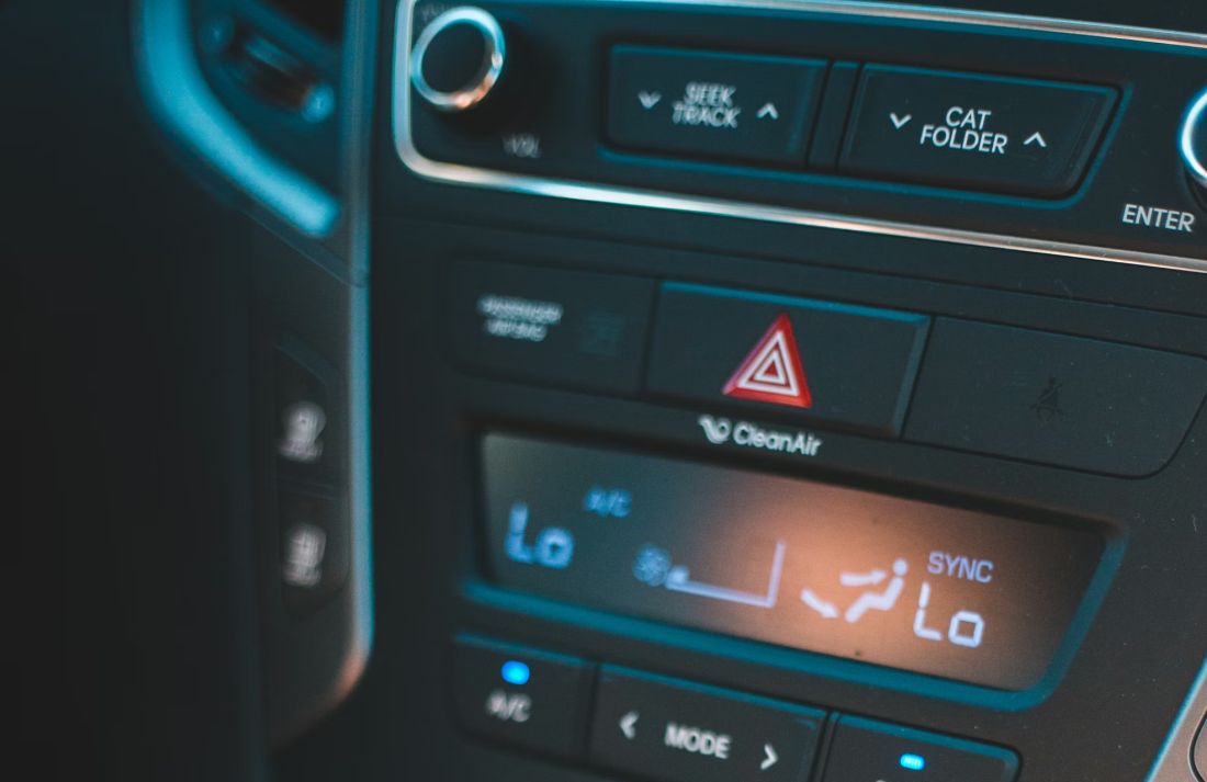
Have you noticed how hazard buttons are usually in the same sort of place? Around the centre, near the top of the dash, or in a spot you can reach without leaning. That’s not random. It’s because hazards are something you might need while steering with one hand, or while your other hand is busy keeping the car stable. And it’s because the button needs to be findable in the dark, in glare, in rain, and when you’re wearing gloves because you’ve just scraped the ice off the windscreen at 7am.
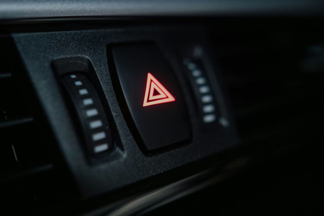
This is also why hazard buttons are generally bigger than, say, the button that changes radio stations. Bigger target, easier hit. And they’re usually shaped or raised so your finger can tell “yep, that’s it” without you staring at it. That idea lines up with what Euro NCAP talks about when they describe controls you can discover by touch, with minimal eyes-off-road time, plus feedback you can feel. When a control gives you that click or movement, you don’t have to look down to confirm it worked. You feel it. That’s a big deal in a moment where you’re trying to stay safe, not trying to admire the dashboard design.
There’s another angle too: reliability. Screens are brilliant, but they’re still computers. They can lag. They can restart. They can bury a function under a pop-up or a warning screen. A dedicated hazard switch is simpler. It’s built to do one job. If the rest of the system is having a wobble, you still want that button to do its thing. No drama. Press and the car signals danger. That simplicity is why you’ll keep seeing a real hazard switch in loads of cars, even as everything else becomes “tap here, swipe there.”
How hazard lights are meant to be used around here
Hazard lights aren’t a “say thanks” feature. People do that, sure, but the official advice is about warning other road users. The Highway Code section on breakdowns says to warn other traffic by using hazard warning lights if your vehicle is causing an obstruction. It also says that if you’ve had to stop on the hard shoulder, you switch your hazard warning lights on. That’s the bread-and-butter use case: you’re stopped or you’re in trouble, and you need cars behind to spot you early.
There’s also guidance about using hazards while moving, but it’s narrow. The Highway Code’s rule about hazard warning lights says you can use them when your vehicle is stationary to warn you’re temporarily obstructing traffic, and you shouldn’t use them as an excuse for dodgy parking. It also says you shouldn’t use hazards while driving unless you’re on a motorway or an unrestricted dual carriageway and you need to warn drivers behind you about a hazard or obstruction ahead, and then you use them only long enough for the warning to be seen. That’s why you’ll see drivers give a quick flash of hazards when traffic suddenly stops on the motorway. It’s a short “heads up” to the car behind, not a new permanent driving mode.
So, if you want a simple mental rule that fits Manchester and Stockport roads: hazards are for warning. Not for manners. If you’re stuck in a live lane because something’s failed, hazards. If you’ve had to pull over somewhere awkward and you’re a risk to passing cars, hazards. If traffic on the motorway slams on and you’re trying to stop someone ploughing into the back of you, a quick hazards warning can help. And in all those moments, the reason we’re even talking about physical buttons is because you don’t get much time to mess about.
What to check on a used car before you buy it
This is the practical bit, and it’s easy to do. When you’re looking at a used car, don’t just check the paint and the tyres and the service history. Sit in the driver’s seat, set your hands on the wheel like you’re about to drive through Reddish in rush hour, and try to find the hazard button without looking down for ages. You’re not doing it to show off. You’re checking whether, in a stressful second, you could hit it straight away.
If the hazard control is a physical button, notice the feel. Does it have a clear press? Does it feel solid? When you press it (while safely parked), do you get an obvious sign that it’s working? The symbol standard talks about the hazard warning symbol applying to the control and also to a warning light that shows it’s active. You want that “yep, it’s on” feedback to be clear, because you don’t want to guess.
If the hazard control is on a screen, be honest with yourself: how many taps does it take from the normal driving screen? Can you reach it fast if you’re wearing gloves? Euro NCAP’s wording about controls and touch surfaces points out real issues like gloves and cold fingers making touch input less dependable. That matters here in the North West, because wet weather plus cold hands is basically a local tradition.
We don’t bang on about this in every chat at Dace Motor Company because it’s not the flashy part of buying a car, but it’s a smart check. Hazards are one of those features you might never use for months… until the day you really need them. And on that day, you won’t care about the screen graphics. You’ll care about speed and certainty.
So why do physical hazard buttons keep winning?
Put it all together and it starts to feel obvious. Hazard lights sit at the meeting point of rules, safety, and human behaviour. The icon is standard because drivers need quick recognition across different cars. The function itself is treated as a distinct warning device in UK lighting rules, with one switch making all indicators flash together. The Highway Code pushes hazards as a warning tool in breakdowns and incidents, and it gives specific advice for motorways and hard shoulders. And the human side matters: stress and adrenaline can make you clumsy, which the NHS explains in everyday terms, and Walter Bradford Cannon described the body’s emergency “fight or flight” response way back in 1915.
Then you’ve got the modern problem: screens pull attention away, and big studies have measured how long these tasks can distract drivers. That’s why safety scoring is now leaning back toward controls you can find by touch with almost no eyes-off-road time. Euro NCAP’s documents are basically saying, in a polite testing way, “Stop making drivers play tablet games while driving.” And you can see car brands responding in the real world, too.
If you’re local and you’re car shopping, just keep this in your head: the hazard button is a tiny part of the cabin, but it’s a big clue about how the car treats driver attention. If you pop into one of our Stockport sites or our Eccles showroom, we’ll happily walk you through the basics of the interior controls on anything you’re looking at, no pressure. And if you’re thinking about used car finance, we can run a soft search that doesn’t leave a hard mark on your credit score, which is handy when you’re still comparing options.