


Why Car Interiors Are Starting to Look Like Smartphones
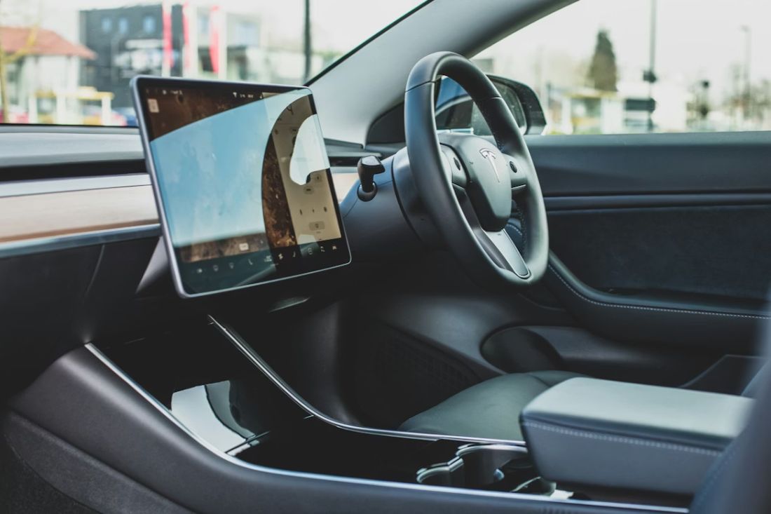
Walk into almost any newer car and you’ll spot it straight away: a big shiny screen sitting in the middle like it owns the place. The dash used to be knobs, dials, and buttons you could hit without even looking. Now it’s more like a home screen, with little icons, menus, and pages you swipe through. And yeah, it can feel a bit weird at first, like your car’s trying to copy your phone. But there’s a reason it’s happening, and it’s not just car makers trying to show off.
Think about how you use your phone. You tap for music, tap for maps, tap for messages, tap for temperature in a smart home. You don’t read a manual every time. You just poke the screen and expect it to make sense. Car companies noticed that. If a screen feels familiar, buyers feel more confident in it. And when you’re shopping for a used car around Manchester or Stockport, that matters. You can jump between cars without feeling like you’ve landed in a spaceship with 900 mystery buttons.
There’s also the “one screen does loads of jobs” thing. Instead of separate bits for radio, sat nav, car settings, phone calls, and parking camera, a screen can hold them all. That saves space, and it can make a cabin feel cleaner. Some people love the tidy look. Some people miss the old-school feel. We hear both sides at Dace Motor Company, especially from drivers who do the daily crawl on the M60 and just want the heater or volume sorted without a whole menu hunt.
And here’s the funny part: even when a car isn’t “new-new,” screens have become a big selling point. People ask about screen size like they’re comparing phones. That’s the vibe now.
Smartphones trained all of us to expect “tap, swipe, done”
Let’s face it, most of us have been using phones with touch screens for years, so our hands and brains are already trained for it. The big turning point for the “touch screen is normal” idea really kicked off when Apple introduced the first iPhone in 2007, shown on stage by Steve Jobs. The whole point was that you could control loads of things with your fingers on one screen instead of using a physical keyboard. That idea spread everywhere. Phones, tablets, ticket machines, self-checkouts, even the screens in fast food places where you tap your order while your mate is still deciding.
Car makers saw that and thought, “Why fight it?” If people already understand icons, swipes, and menus, it’s easier to sell the tech. And honestly, it can be easier to update too. A phone can change how it looks after an update. Cars want that same feeling. Nobody wants a car that feels stuck in 2012 forever, especially when your phone changes every year.
There’s also a style thing. Phone screens are glossy and bright, and they make tech look modern. Put a big screen in a car and suddenly the interior looks newer, even if the seats and steering wheel are basically the same idea as they’ve been for ages. You’ve probably noticed this when you sit in different used cars back-to-back. One has a small display and lots of buttons, and it feels older. Another has a wide screen and a neat layout, and your brain goes, “Yep, this one’s newer,” even if they’re the same year.
And because we’re used to phone screens being the “control centre,” we now expect the car’s screen to do that too. Music, calls, maps, settings, the lot. The car interior starts copying the phone, because the phone basically taught everyone the rules.
The big screen arms race (and some real examples you’ll recognise)
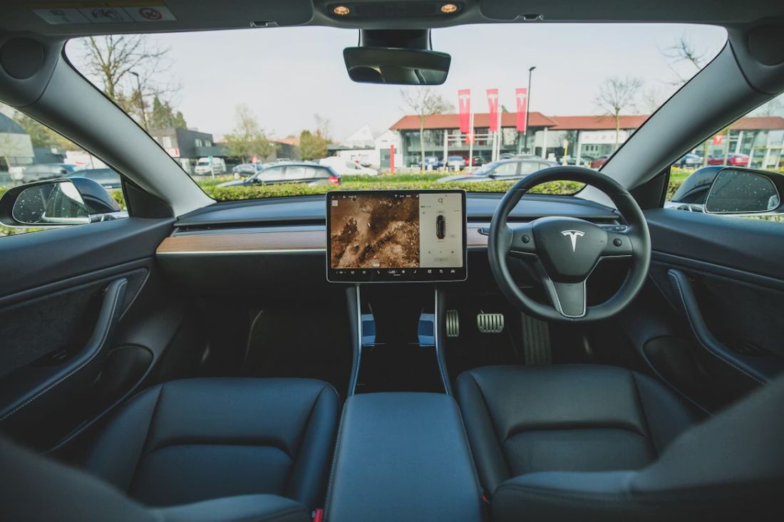
Some cars pushed this screen thing so hard that it changed what people expect from a dashboard. A famous example is the Tesla Model 3, which launched with a 15-inch central touch screen that runs loads of the car’s functions. That screen isn’t just for maps. It’s where you control settings, media, and more. It made people talk about dashboards in a totally different way, like, “Wow, the whole car is basically the screen.”
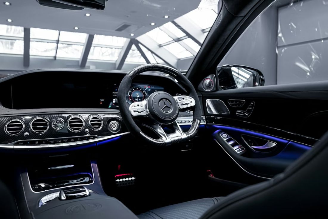
Then you’ve got the super-luxury side going even bigger. Mercedes-Benz introduced what it calls the MBUX Hyperscreen, and it’s basically a wide glass panel stretching across the dash, about 141 centimetres wide (over 56 inches). That’s massive. It looks like three displays blended into one long display band. And once that exists, smaller screens start looking small, even if they’re totally fine.
Another proper example is BMW and its curved display setup. BMW’s own press info talks about a curved display where a 12.3-inch driver display and a 14.9-inch central control display sit together as one unit. That’s the same “one big screen” feeling again. It’s not random. It’s a clear trend.
Now zoom back to normal everyday cars you’ll see around Stockport and Manchester. You’ll notice screens got bigger in Volkswagen models, Ford models, and loads of others, even when they’re not fancy. People want a clear reversing camera view. They want maps they can read quickly. They want music and phone stuff without balancing a phone on the dash like it’s 2010.
The result is that dashboards are starting to look like a phone and a tablet had a baby, and that baby moved into your car. Some people love it. Some people roll their eyes. But it’s happening across the market, from small runabouts to bigger family cars.
Why your phone started “moving into” your car in the first place
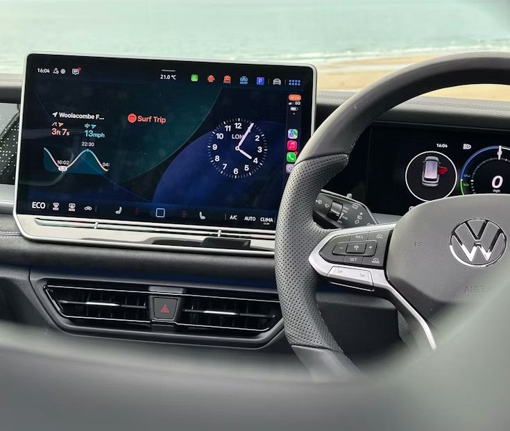
A huge reason this shift feels so phone-like is because car screens started copying phone apps on purpose. The best-known example is Apple CarPlay, which Apple CarPlay announced in early 2014 as a way to use key iPhone apps on the car’s display. You plug in (or connect wirelessly in some cars), and suddenly the car screen looks like a simple phone-style layout for maps, calls, messages, and music. That’s not the car making its own system “feel like a phone” by accident. It’s literally your phone’s setup appearing on the car screen.
Why do people like that? Because it’s familiar. If you already know how your maps app works on your phone, you don’t have to learn a brand-new car system from scratch. You can get in, type a destination, and go. And around Manchester, where one wrong turn can dump you into a roundabout circus you didn’t ask for, having familiar maps matters.
There’s also a safety angle, even if it doesn’t always feel that way. The idea is “use the car screen instead of holding your phone.” That’s the pitch. And it can help keep your phone out of your hands. But it also means the car’s screen needs to be good, responsive, and bright enough to read in daylight.
What’s funny is that this makes car makers compete with phone makers in a way they never had to before. People judge the screen speed. They judge the menu layout. They judge the graphics. If the screen lags, people get annoyed the same way they do with a slow phone. If the icons look old, people complain. That pressure keeps pushing car interiors to look more like phones, because phones set the standard for “how screens should feel.”
So yeah, your car interior isn’t just copying a phone because it looks cool. It’s copying a phone because your phone became the thing everyone measures screens against.
Cars want updates like phones, and that changes the whole cabin
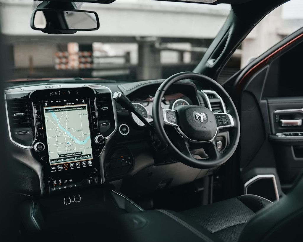
This is another big reason interiors are changing: cars now get software updates the way phones do. Tesla talks openly about cars getting over-the-air updates that add features and improve existing ones over Wi-Fi. That idea has spread across the industry. Car makers want to fix bugs, add features, and change layouts without you coming into a workshop for every tiny change. And once updates become normal, the screen becomes the main “stage” where those updates show up.
With a screen-based cabin, a car can get a new menu layout, new media options, new driver info screens, and sometimes extra features. That’s phone behaviour, right? Your phone updates and suddenly a button moved or there’s a new setting. Cars are heading the same way.
This also feeds into subscriptions and add-ons, which is a whole other conversation people have strong feelings about. But from a pure design angle, it pushes brands to build cabins where the screen is the centre of everything. Because if the car is going to change over time, you need one place that can display those changes. Physical buttons can’t update themselves. A screen can.
Now, for used car buyers, this matters in a more practical way. When you’re looking at a car, you’re not just checking the mileage and service history. You’re checking if the screen works smoothly, if the camera is clear, if the system connects to your phone, and if it feels easy. People do a mini “phone test” on the car screen without realising it. Tap a few icons. Try the music. Try the map. If it feels clunky, it puts people off, even if the car drives great.
And in real life around Stockport, where you’re dealing with rain, traffic, school runs, and last-minute trips to the Trafford Centre, you want controls that don’t make you think too hard. That’s where the “phone style” can either be brilliant… or annoy you, depending on the car.
Why car makers keep choosing screens (even when people moan about them)
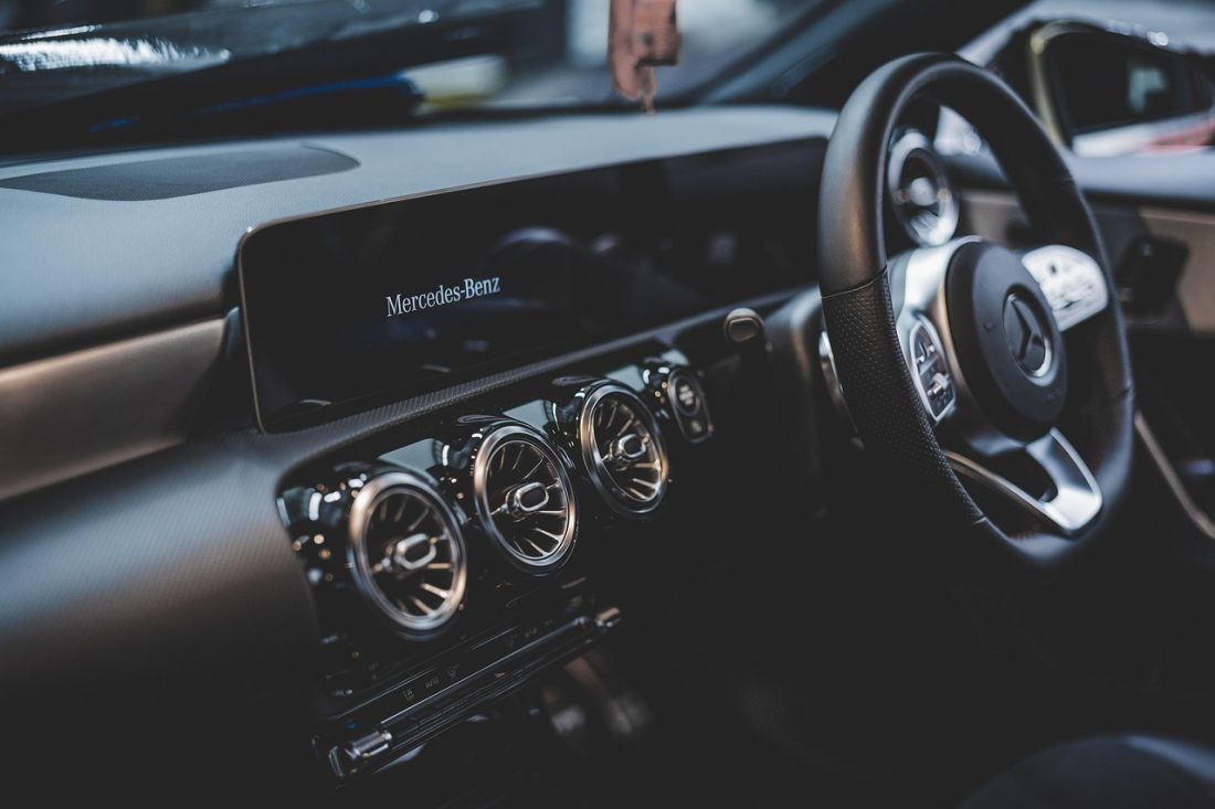
Car companies aren’t doing this just for fun. Screens solve a bunch of problems for them. First, one screen can replace loads of separate parts. Physical buttons, switches, and dials cost money, take time to fit, and can break in different ways. A screen is still a part that can fail, sure, but it can replace a whole panel of buttons with one unit and some software.
Second, screens help brands standardise things. If a company sells cars in lots of countries, it can use the same screen hardware and then change the language in software. If a model has different trim levels, the screen can be the same, and the extras are unlocked with software. That’s simpler for manufacturing.
Third, screens sell cars. People see a big display and it feels “new.” It’s like walking into a mate’s house and seeing a massive telly. You just assume it’s modern. Same idea.
There’s also the marketing side. A screen looks great in photos. When you’re scrolling listings, the interior shot with a bright display grabs attention. And when you’re shopping used cars, that matters because you’re comparing loads of cars quickly.
Now bring it back to real buying around Greater Manchester. A lot of drivers here want sensible, reliable cars, but they still like a cabin that feels fresh. That’s why you’ll see people looking at used Audi, used BMW, used Volkswagen, used Toyota, and even something like Alfa Romeo for a bit of style, and they’ll still ask, “What’s the screen like?” Screen size and ease-of-use has become part of the value, even if nobody says it out loud.
So the screen trend isn’t just a design phase. It’s tied to cost, sales, updates, and what buyers now expect. That’s why it keeps rolling on, even when people complain that they miss simple knobs.
The downside: screens can distract you, and people are pushing back
Here’s the part nobody wants to ignore. Touch screens can pull your eyes off the road. And you don’t need to be a scientist to feel that. If you’ve ever tried to change a setting and ended up staring at a menu while the car’s moving, you know the feeling. It’s not great.
There’s proper research on this too. The AAA Foundation for Traffic Safety tested infotainment tasks and found that programming navigation took drivers an average of 40 seconds in the systems they looked at. Forty seconds is ages when you’re driving. Even if you glance up in-between, your attention is split.
Because of that, you’re seeing a shift. Some brands are bringing back physical buttons for key stuff. Volkswagen, for example, has talked about reintroducing physical controls for vital functions, with its design chief Andreas Mindt saying they’ll bring back buttons for key things like volume, heating, fan controls, and hazard lights. That’s a pretty big change in direction.
Safety testing is also nudging companies. Euro NCAP has said its 2026 testing plans target driver distraction, and it’s pushing for dedicated physical controls for core functions like indicators, hazard lights, wipers, the horn, and emergency call functions if car makers want top ratings.
So it’s not a simple “screens everywhere forever” story. It’s more like a tug-of-war. People like big screens for maps and cameras. People hate digging through menus for things they use every day. And the industry is reacting, slowly, to what real drivers say. You see it in reviews, in safety talk, and in the fact that buttons are creeping back in.
What this means when you’re buying a used car around Manchester and Stockport
If you’re shopping for a used car, the screen stuff isn’t just a trend to gossip about. It affects how happy you’ll be day-to-day. Here’s a simple way to think about it: you want the best bits of the “smartphone dashboard,” without the annoying bits.
When you sit in a car, don’t just admire the screen. Test it like you’d test a phone in a shop. Tap through the menus. Try the radio. Try connecting your phone. Check how easy it is to change the temperature or fan speed. If you have to take your eyes off the road in your imagination just to do something basic, that’s a red flag. And yeah, you can spot that even on a test drive around the local roads, whether you’re near the Stockport end or the Manchester side.
Also, think about your routine. If you do lots of motorway driving, a clean, easy screen for navigation and music might be brilliant. If you spend your life stopping and starting in traffic, or doing school runs, you might want proper buttons for quick changes without menu hunting. There’s no one perfect answer. It’s about what will annoy you least after six months.
On the money side, screens and connected features can affect what you pay, but finance choices matter too. If you’re checking finance options, a soft search is meant to be the kind that doesn’t change your credit score. That’s how Experian explains it: soft checks aren’t visible to lenders and don’t affect your score. That’s useful if you’re just getting a feel for what’s possible before you commit.
And because we’re a family-run group with four sites around the area, we see a big mix of preferences. Some buyers walk in wanting a simple cabin that just works. Others want a wide screen, phone mirroring, and a reversing camera they can see clearly even on a grey rainy day. Either way, the main advice stays the same: treat the screen like a real part of the car, not an extra. You’ll be living with it every day.